ShopDreamUp AI ArtDreamUp

Deviation Actions


Suggested Deviants


Suggested Collections


You Might Like…


Featured in Groups


Description
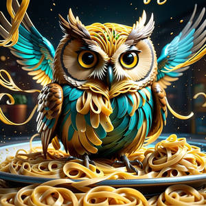
So, I played around with it a little bit more, and I came out with this. I like it a LOT better, too.
I was just going to have the typeface up top be impact, but my teacher said I should play around with the letter forms a bit. which turned out SOOOO much better!
I also gave him a beak. <3
Again, DON'T STEAL IT OR I KEEL YOU! D8< -shot-
~Imp~
I was just going to have the typeface up top be impact, but my teacher said I should play around with the letter forms a bit. which turned out SOOOO much better!
I also gave him a beak. <3
Again, DON'T STEAL IT OR I KEEL YOU! D8< -shot-
~Imp~
Image size
1158x1460px 549.17 KB
Comments18
Join the community to add your comment. Already a deviant? Log In
[Vision]:
This is a beautiful work where we can easily see an artistic process. Everything is linked together (Owl City, the owl itself, the night atmosphere) and matches pretty well. Without being unique, this work is clearly polished and interesting.
[Originality]:
This interesting part in this work is clearly the details. The entire work isn't very original itself, but some ideas put in it bring attention. For example, the town we can see "through" the owl, or the 80s-90s cartoon aspect of the stars and the title.
[Technique]:
The technique itself is mastered, but some mistakes easily avoidable are present, the two major one being the little clear mark of the owl eye, and the too close color tone between the background ans the top left building "in" the owl (which results in a lack of contrast between the owl and the back of the image).
[Impact]:
Sadly, even if the work itself is really nice, the impact isn't very here. I would explain that by the lack of bright atmosphere (as strange as it appears) caused by the night thematic, not compensated enough by the yellow tones used. But the work still is beautiful and well done.
[PS: English is not my first language (obviously), so sorry for any mistakes... I hope you will still understand what I try to say in each category! <img src="e.deviantart.net/emoticons/b/b…" width="15" height="15" alt="